Lazy Loading
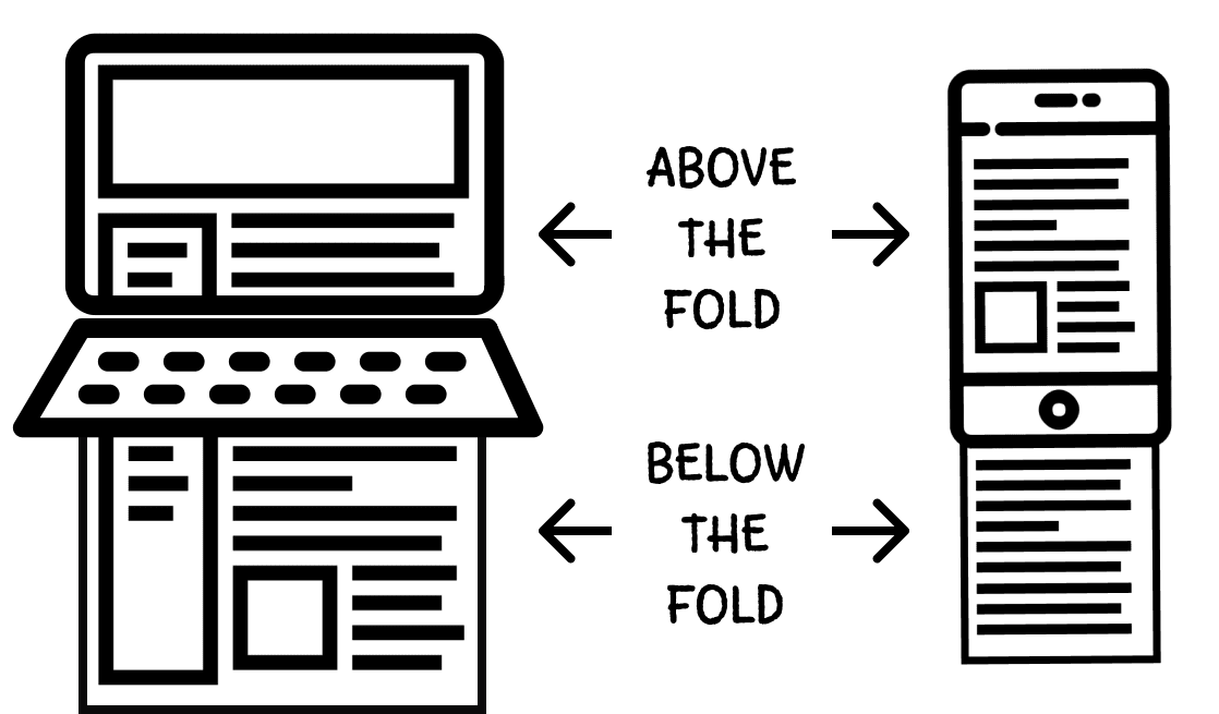
Web pages contain a large number of images that inflate the page size and reduce their loading speed. Most of the images are outside the initial screen (below the fold), so the user will only see them after scrolling down the page. This means that you may be loading something that the user will never see, but will spend time and possibly money on it. Loading non-critical content also wastes smartphone batteries and other system resources.

The terms “above the fold” and “below the fold” come from pre-digital times. If you have ever bought a newspaper at a newsstand, you know that they are usually half-folded, and people passing by can only see the top half of the first page. If they do not like what they see, they will pass by, and sales will drop. This is why it is so important to place top-selling content at the top of the page.
Lazy loading is a technique that delays the loading of non-critical resources during page loading. Instead, these non-critical resources are loaded only when needed. This reduces the initial size of the resources that must be loaded to display the page, the use of system resources, and makes its loading and subsequent rendering faster. All this has a positive effect on performance.
You have probably already seen lazy loading in action. It looks something like this:
- You get to the page and start scrolling as you read the content.
- At some point, you reach the placeholder image.
- The placeholder image is suddenly replaced by the actual image.
loading attribute
Previously, developers had to rely only on JavaScript capabilities. Modern browsers, though, can do this without JavaScript, but unfortunately not all of them do. The loading HTML attribute of the <img> tag is supported natively in all modern browsers except Safari. With it, browsers are able to lazy load below the fold images until the user scrolls down to them.
<img src="my-image.jpg" loading="lazy" alt="Image description" />
It supports three values:
lazy- the browser will lazy load the image.eager- the image will be loaded as soon as possible, that is, without lazy loading.auto- the browser decides whether to perform lazy loading or not. This is the default value.
You cannot find out or change the behavior and mechanism for determining the time of image lazy loading by the browser. The main thing is that the browser will load such images shortly before they get in the viewport.
Open the Network tab in the developer tools and select the Img filter to show only image loading. After that, scroll through the example and watch how the below the fold images of cats are loaded. Browsers that support the loading attribute will lazy load images, while browsers without such support will load all images at once.
lazysizes library
To ensure cross-browser compatibility, that is, compatibility with older browsers, or those that do not yet support this natively, you can use a number of existing JavaScript libraries. The most popular are lazysizes, vanilla-lazyload and lozad.js. The choice of a library comes down to their features and personal preferences. We will take a look at the lazysizes library.
Native support is better and faster than using libraries, but they are guaranteed to work in all browsers and can provide advanced lazy loading capabilities that are not yet standardized.
The first thing to do is adding the library to the project using the cdnjs.com service. A script referencing tag is added to the end of <body>, the same as for the Lodash library.
<body>
  <!-- HTML-markup -->

  <!-- Lazysizes library script file -->
  <script
    src="https://cdnjs.cloudflare.com/ajax/libs/lazysizes/5.3.2/lazysizes.min.js"
    integrity="sha512-q583ppKrCRc7N5O0n2nzUiJ+suUv7Et1JGels4bXOaMFQcamPk9HjdUknZuuFjBNs7tsMuadge5k9RzdmO+1GQ=="
    crossorigin="anonymous"
    referrerpolicy="no-referrer"
  ></script>
  <!-- Your script file -->
  <script defer src="path/to/script.js"></script>
</body>
lazysizes is self-initialized when loaded to the page. That is, for basic use you do not have to do anything in JavaScript. A complete list of its capabilities can be found in the documents.
For all images that need lazy loading, set the lazyload class and replace the src attribute with data-src. The lazysizes loader needs this to work properly.
<img class="lazyload" data-src="path/to/my-image.jpg" alt="Generic alt" />
While the image is loading, you can show a low-quality placeholder. This technique is called LQIP (Low Quality Image Placeholder). There are many options for implementing LQIP, but for now, it will be enough to show one standard placeholder instead of all images. To do this, add the src attribute; its value will be a reference to this placeholder image.
<img
  class="lazyload"
  src="path/to/lqip-placeholder.jpg"
  data-src="path/to/my-image.jpg"
  alt="Generic alt"
/>
When the image has been loaded, lazysizes adds the lazyloaded class to the element. This can be used to add CSS effects at the time the image is loaded.
.blur-up {
  filter: blur(5px);
  transition: filter 400ms;
}

.blur-up.lazyloaded {
  filter: blur(0);
}
After style declaration, add the blur-up class to the <img> tags.
<img
  class="lazyload blur-up"
  src="path/to/lqip-placeholder.jpg"
  data-src="path/to/my-image.jpg"
  alt="Generic alt"
/>
Let's demonstrate all these steps and add cross-browser compatibility for lazy loading images to our site about cats. Now even Safari does lazy loading of images.